Hockey is back. Between that and the release of Seattle’s team name and logo last August, we thought we’d get one of our professional designers to discuss some of her favourite NHL logos – strictly based on their design.
In no particular order, here they are!
Honorary Mention: Seattle Kraken
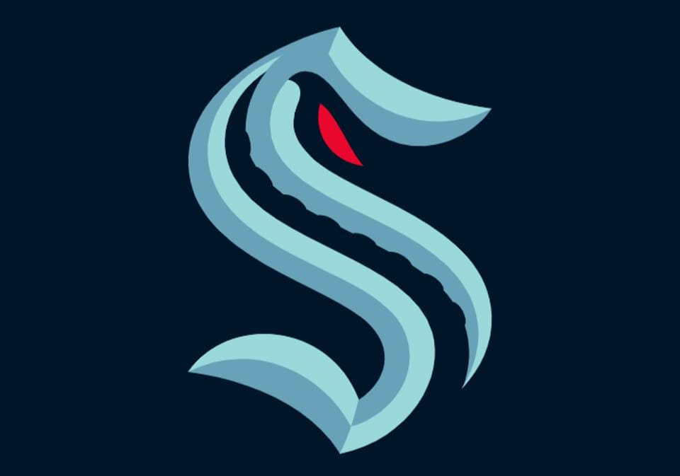
Debuting in the 2021-22 Season
Quite possibly my newest favourite NHL logo.
What’s Good About It?
This logo has everything I dig in a logo: symbolism, hidden meaning, and representation of the city and the fans. The franchise did an amazing job of releasing the meaning (or releasing the Kraken, if you will) and explaining its intricate meaning.
The sharp bevelling on the lettering is reminiscent of carved lettering on ships – with the tentacle reaching up through the negative space – representing the dark waters in Puget Sound. I love the red eye of the actual monster glaring through the top of the S. The curve of the S around the eye also makes the logo threatening, without having to add the entire Kraken.
It’s full of symbolism while managing to remain simple, clean, and modern. I love it.
What’s Not Working?
Nothing. I’m here to petition all the NHL teams release the meaning behind their logos in this way,
I love it, I love this logo, and I’m betting I’ll love this team.
Vegas Golden Knights
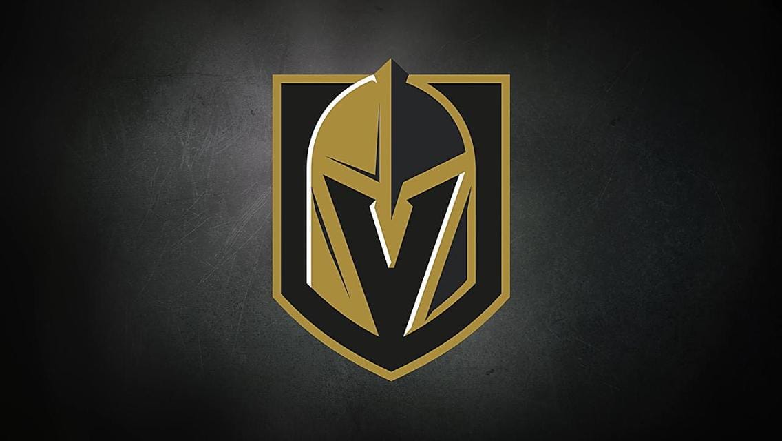
Logo Debut: 2017/18 Season
What’s Good About It?
I love this logo. Clearly, a new modern era of logos has begun with the Knights and the Kraken. I, for one, am here for it. The negative space in this logo creating a “V” takes the knight helmet from being just okay to looking aggressive and cool – even without a face. Once you see the negative space, you can’t unsee it and it just adds to the intricacy of the simple logo.
What’s Not Working?
I have to take some marks off for the gold in this image. It looks better on the jerseys than it does here, which means the overall colours are a bit too muted.
Nashville Predators
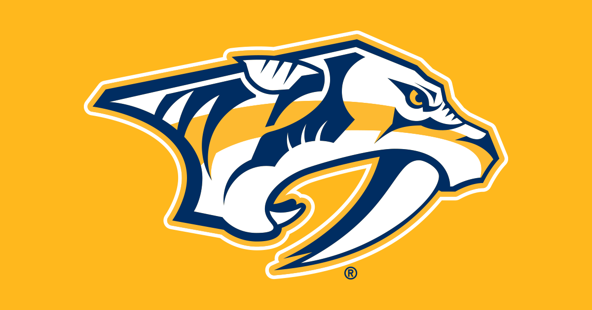
Logo Debut: 2011/12 Season
What’s Good About It?
The Nashville Predators were named after a site in downtown Nashville where sabre-toothed tiger bones were uncovered in 1971. While excavating to create the foundation for the UBS building, the workers uncovered a cave containing a 9-inch fang and a foreleg bone of a sabre-toothed tiger.
The logo nods at this story in an amazing way. The logo’s aggressive – to match the name of the team – and the light outline helps contrast the colours in the Predators logo. The lines also give this logo the feeling of forward movement and speed — two ideal traits for a hockey team.
What’s Not Working?
The story makes this logo work. Yet, I think some detail – similar to the original version in 1998 – would make it stronger.
Interestingly, the logo was created before the name. This isn’t a normal process for logo creation and branding, but it actually works here.
Minnesota Wild
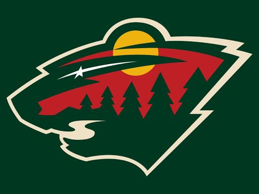
Logo Debut: 2013/14 Season
What’s Good About It?
This one is up there on the favourites list. The Wild have packed a lot of symbolism and hidden meaning into this logo.
First off, Wild is a cool name. It’s one of the few sports teams to not have a plural name and it’s intriguing. The symbolism in this logo is incredible: the star in the eye representing the past North Stars, the wilderness scene inside the animal shape with the river showing the mouth. I also love the fact that Minnesota calls it the wild animal instead of stating a specific species.
Everything adds to the intrigue of the team name — and that’s branding, friends. It feels wild, rustic, and free and – I’ve never been to Minnesota – but that’s how I imagine it to feel.
What’s Not Working?
The outline of the logo is lighter than the inside while still using the same colour tones. This lends to it feeling like more of a wild muddle of shapes, rather than a concise outline.
Also, the look is maybe not as ferocious as say the Preds or Sharks.The way the mouth is styled to be teeth and a river at the same time takes away from the ferocious. The rounded corners of the river take away the sharpness of the teeth. Sometimes using negative space this way works out, but in this case it hurts the logo more than it helps.
Detroit Red Wings
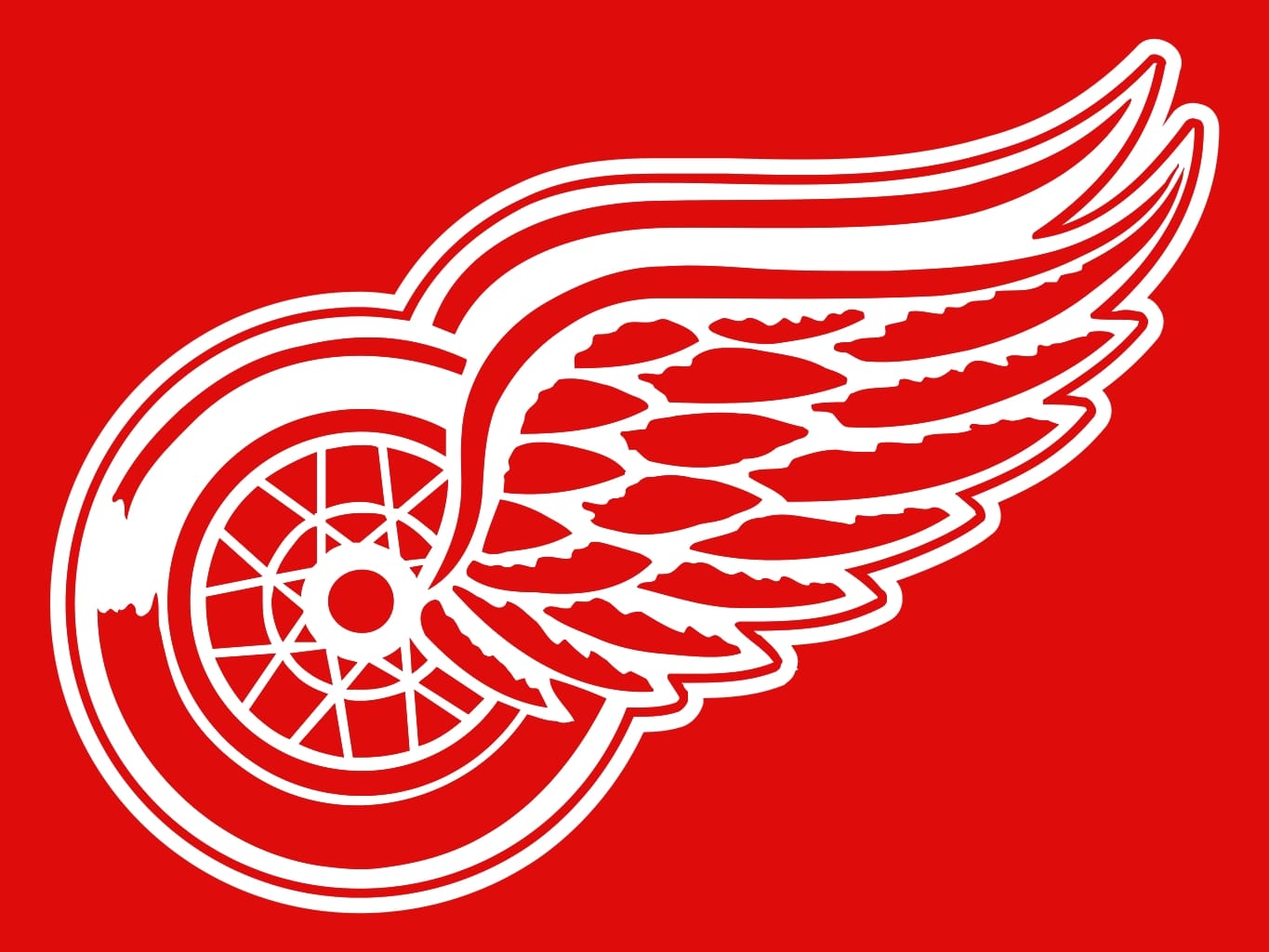
Logo Debut: 1948/49 Season
What’s Good About It?
This logo is a classic. As an original 6 team, this logo has been around for a long time and it’s still top of my list. This is a team that I would jump on the bandwagon for just to buy their apparel.
The winged wheel holds a lot of history – not just for the Detroit area, but also for the team. The wheel is a clear reference to the Motor City, and its style and striking colour still give it that icon status today. It’s a risk when a logo only has one main colour, which means it has to rely mainly on its style to catch the eye of fans or other audiences.
With the Red Wings’ clean lines and simple detail, this logo stays visible at all sizes without using another colour to distract or draw attention. It does not disappoint.
What’s Not Working?
There is honestly nothing in this logo I would change. Normally I advocate for another colour or two but in this case the single colour works.
Just goes to show that new isn’t always better. In this case both the newest logo in the league and one of the oldest are my all-time favourites.
Battle of Alberta
While I can’t say either of these logos are my favourite in the NHL. I felt it would be unfair not to include my opinion of the home team logos, seeing as we are a local Alberta company.
Edmonton Oilers
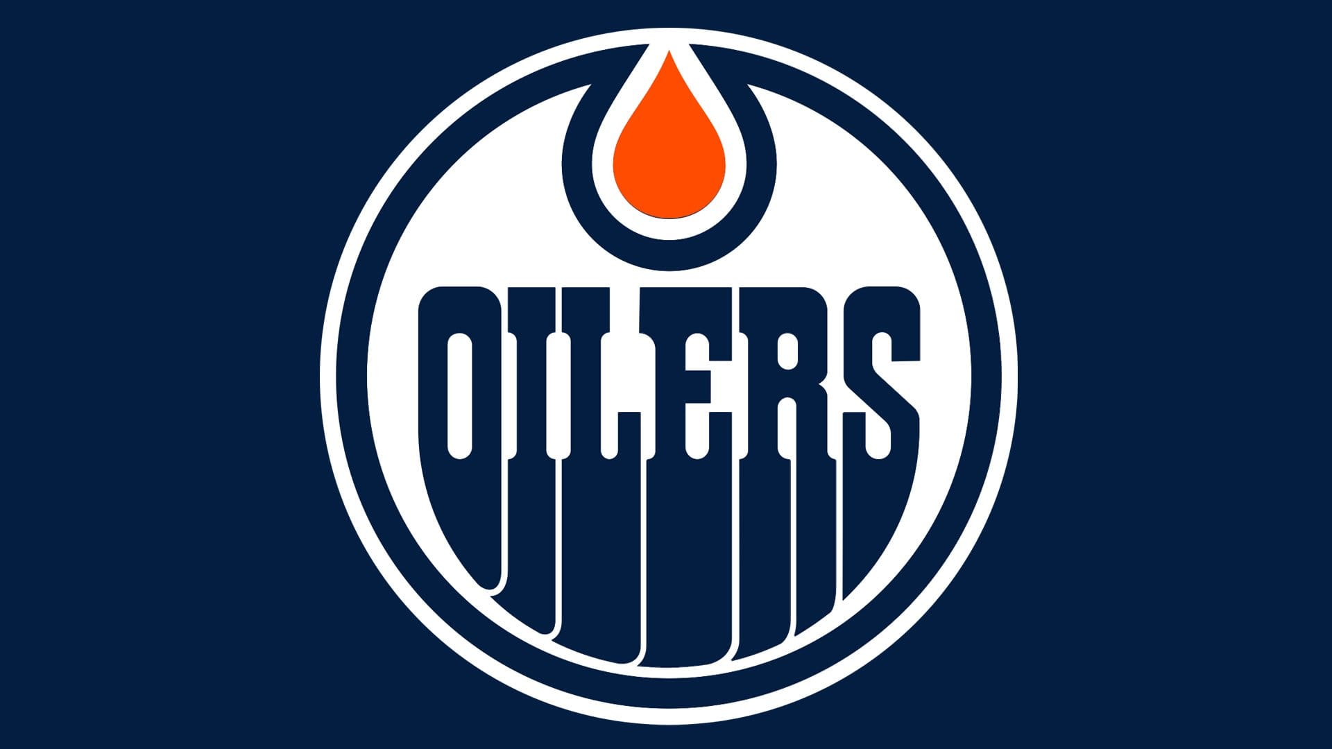
Current Logo Debut: 2017/18 (However this was only a debut of updated colours the logo has been the same since 1972/73)
What’s Good About It?
The Oilers logo is nothing if not consistent — can’t say the same for the team. But, seriously. Talk about brand recognition. This logo hasn’t changed its general look for every year they’ve been a team.
And why would they? This logo is cool. The bright orange oil drop contrasting with the dark retro letters: it’s another icon in the NHL.
And, okay. Oil is not bright orange, but there is strong symbolism here with Alberta’s energy sector, and I believe this represents the city nicely.
What’s Not Working?
The colours contrast, but the rest of the logo is pretty flat. The font – again, it’s iconic – is also just a touch too retro. It’s probably overdue for at least a bit of an update.
My eyes also always stuck on the gap along the edge of the Oilers name and the circle. If they just stretched the wording a bit so the gap was equal along the edge of the name, I would be much happier. (And trust me when I say I never advocate for stretching a logo in that way.)
Calgary Flames

Current Logo Debut: 1994/95
What’s Good About It?
Listen, I’m not a Calgary fan (Sorry!) but even I can’t deny that this logo is memorable. No one walks past a Flames logo and misses it. It does what a good logo should do.
The C is simple enough to not get lost in the flames but still bold enough to stand out. Not to mention the red and yellow colours scream “Caution: Hot Do Not Touch.” (Sometimes, this also means, “Caution: We burn out in the first round.” I’m allowed to say that I’m a Canucks fan…)
Are there other ways to design flames? Yes. Are there other colours that represent fire? Definitely. Is this logo one of the most iconic NHL logos? You know what? Yes. I think so.
What’s Not Working?
Like I said just above, this logo could probably use some refreshing or updating. Maybe a slight change in logo is exactly what Calgary needs.
*All logo designs belong to and are trademarked by the NHL and their respective teams. nine10 inc. is not endorsed by, sponsored by, or otherwise affiliated with the NHL or any of the mentioned NHL franchises.