Challenges
Oliver’s is an Independently owned and operated funeral service company that provides full funeral services from the most elaborate to direct cremation. Having been established in the early 1900s, Oliver’s is a household name to older generations of the Grande Prairie area. Historically, Oliver’s has enjoyed a strong family referral business but the changing realities of the funeral business, growth in the community, and fresh competition have all resulted in a weakening of Oliver’s traditional referral business. As part of their 100th year in the community, and to respond to competition in the marketplace, Oliver’s Funeral Chapel sought a revitalized brand identity and fresh marketing push to make Oliver’s more progressive in its marketing and service offerings.
Recommendations
After performing a full analysis of the business and competitive landscape, nine1o determined that Oliver’s would do well to position/reposition themselves as the region’s premier full-service funeral service provider as experts at traditional and non-traditional funeral services. As part of this repositioning, a new course for Oliver’s brand was needed to help give the business direction and a consistent purpose. Most importantly, Oliver’s needed to bring their visual brand into the 21st century.
nine10 recommended a new brand be developed with a look and feel that is professional, progressive, comforting, helpful, and memorable. In order to keep brand consistency in the marketplace, a Visual Identity & Brand Standards Guide was developed. nine10 also provided future recommendations for moving Oliver’s forward as a more progressive leader in the marketplace once the newly developed brand had been introduced.
Solutions
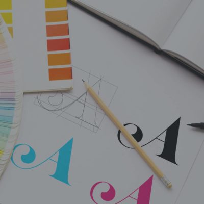
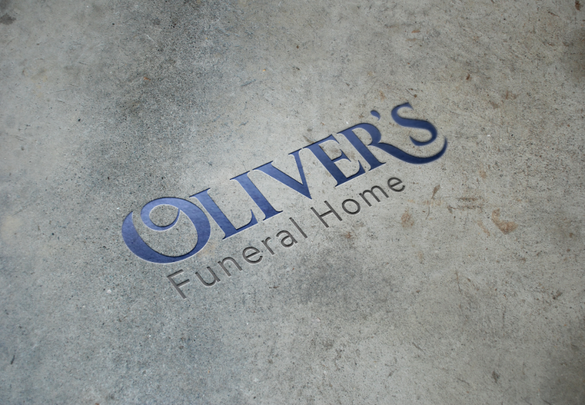
Logo
In designing the logo, nine10 took into consideration that the resulting design must have the ability to function equally well with both Oliver’s traditional funeral services as well as the more progressive custom services like unique celebrations of life. The overall design needed to achieve a balance between timeless and professional as well as traditional and cutting edge. In order for ease of use in designing collateral and other marketing material the logo ideally needed to be designed to work as one all-purpose orientation, at sizes from pens to building signage. Oliver’s current logo included a swan that limited the brand to being geographically exclusive to Grande Prairie. In order to eliminate this perception, the swan was removed from the design of the new logo. After all these considerations were made, it was determined that a Wordmark was likely the best solution. Unlike a logomark or icon, which could possibly become stale in the future, a Wordmark with elegant and thoughtful typography would elevate Oliver’s brand for years to come.
Visual Identity & Brand Standards Guide
nine10 produced a Visual Identity and Brand Standards Guide for Oliver’s in order to define their logo and brand as well as provide Oliver’s with consistent rules and brand standards to follow. Elements such as the brand (tone, personality, audience, archetype, persona, imagery, etc) were described clearly in the guide as well as technical specifications such as typography and imagery. Templates for business cards, letterhead, email signatures, vertical & horizontal advertisements, billboards and PowerPoint slides were included as part of this guide.
Before
![]()
After
![]()