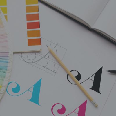
In today’s tip, we’re talking about text overload and too many fonts. Using too many different fonts – and by extension hard-to-read fonts – can cause chaos in whatever design you’re trying to make. I would say you don’t want to use more than three different types of fonts in your graphic, and the fewer you have, the better.
Now, fonts and font weights are different. So, using bold text, italic text, or just different weights of a font is a different story than using completely different typefaces. If you have a font that has a bold weight and a medium weight, a thin weight and say a lightweight font would be okay use in a graphic together. You don’t want to be switching between one font style and a completely different font style in your graphic. That’s where the difference is, but multiple font weights are fine to have in a graphic.
Hard-to-read fonts are particularly an issue with larger designs like billboards or large signs. With billboards, a person often only sees that for five to ten seconds as they drive by, so the font you use on that is very important for readability. Someone has to be able to see that billboard and read it very quickly, so having a large font that is very clear and easy to read is what you’re trying to go for.
This is similar to social media graphics. People scroll on these pages for hours sometimes, and you want to make sure that your graphic is easy to read and catches their attention right away. Even if it’s just one word that people see as they’re scrolling through a feed. you want to make sure they can see that one word clearly so they stop and go back to look at your post.
When we talk about text overload, we mean that we don’t want to have too much content in the graphic of your post. The point of these graphics is to catch someone’s attention so they then read your caption, follow a link, or do something with the information you present to them. The content doesn’t always have to be in the graphic. You can have minimal content in the graphic to catch someone’s attention so that they do the thing you want them to do, whether that’s again reading your caption, following some sort of link, or following some sort of steps. First, you’re just trying to grab attention for a second and then get them to do something else.
Something to remember when you’re building a graphic and you are using fonts in your design is that your logo font doesn’t count as a font. Your logo is separate from the text you’re using in the graphic. So, when I say two to three fonts, you don’t need to count your logo font as a separate font.
If there are any tips you would like to see, let us know, we’d be happy to share those with you!

GO BEYOND QUICK PLAYS & EMPOWER YOUR STAFF TO UNLOCK YOUR HIDDEN RESOURCES AT DIGITAL MARKETING BOOTCAMP.
Our program supplies the tools, knowledge, and confidence so you can bring more of your marketing in-house. LEARN MORE