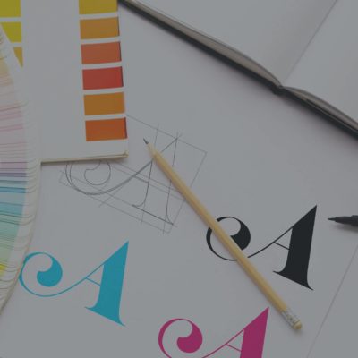
As a graphic designer, my job is to learn which feelings a client wants to show, and then pick the fonts that are going to represent and show that feeling the best. This involves a bit of psychology — or mind reading, if you will — to understand the different styles of fonts, what feelings they invoke, and why.
What I’m really trying to say is graphic design is like reading the audience’s mind before they even know what they are feeling.
It’s just letters. What’s important about that?
Let’s try something: picture a grocery store.
Now, fill the grocery store with things. Think about what kinds of things you want from a grocery store. You’re probably thinking about some fresh fruits & veggies. Good food. You’re probably wanting a variety of choices so you have a lot of different fuel to fill your body.
Now, think about the kind of “vibe” a grocery store would want to have. Chances are they want to be welcoming, modern, fresh, and friendly. The signage is probably brightly coloured, has clear messaging, and yummy imagery. What font fits with this picture you’ve drawn up?
Clear, modern, and easy-to-read fonts.

Generally speaking, if you’re looking for a clear, modern, easy-to-read font, you’re looking for a sans serif – meaning without lines or strokes attached to the end of letters (more on this in a second).
Sans serif fonts match the tone and add to the entire experience (aka the brand) that a grocery store wants its customers to have.
Not totally convinced? If you had a choice between a dark, aggressive looking, grocery store (logo & look) and the bright, fresh, Save on Foods, which would you choose?
![]()
You might like the aesthetic of the darker grocery store logo, but it doesn’t exactly make you trust it’s food. It gives an unsettling impression, and that’s why we’re here today.
Major Font Categories & Their Feelings
Serif Fonts
Serif fonts – fonts with a small line or stroke attached to the end of certain letters – are commonly used by banks and law firms. Naturally, there’s a reason for this. They are classic, traditional fonts that evoke emotions like trust, safety, respect, and authority.
However, some serif fonts are used in very different places like fashion magazines or various fancy retainers.
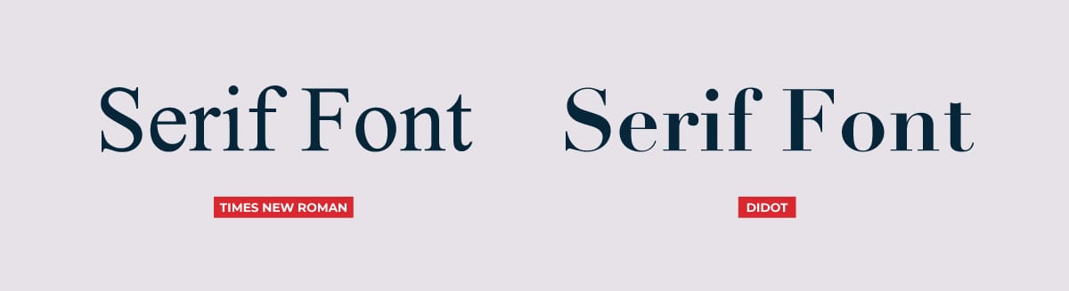
See how the one font is bolder and more compact whereas the other has varied widths and a more elegant feel. Both of these fonts are conveying different feelings: on one side you have a sense of trustworthiness and, on the other, you have a high-class feel. And yet while they both invoke opposing emotions, they also both feel very established and classic.
(And to think you said they were “just letters.”)
Some people claim they are easier to read when using in long-form writing like novels (I would argue that’s not true but that’s a different blog post). This is why many books are typeset in fonts like Times New Roman or Georgia.
Sans Serif
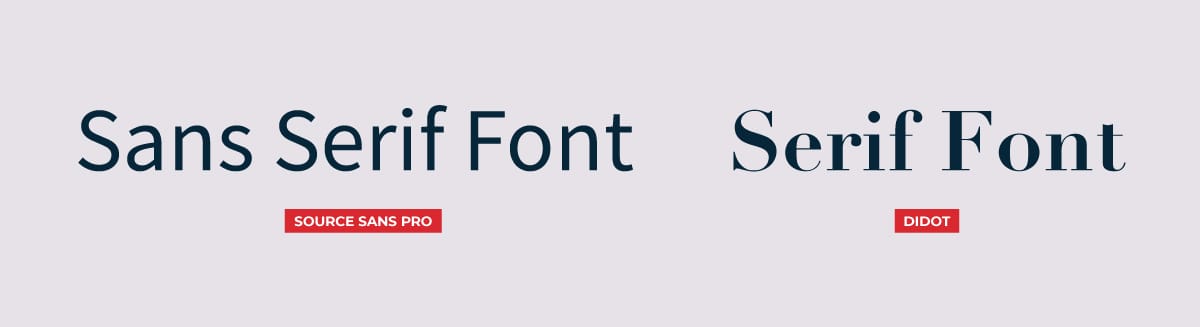
Sans is the French word for “without”; therefore, sans serif is without serifs – more basic, no serif. When sans serif fonts were first introduced, they were not widely accepted then. As modernism came to the design world, sans serifs gained popularity. Sans serif fonts are very popular in digital media and online.
Sans serif fonts are often used for tech companies or social media platforms. Without the extra serifs, these fonts are often sleeker, more accessible, and convey such emotions as friendliness. They also convey open-mindedness and a cutting-edge nature.
Similar to serif fonts, many different places use sans serif fonts outside of tech giants — for example, grocery stores. The goal of these fonts is to bring a modern and easy-natured feel to a company. This contrasts with the modern and exclusive feel from the serif font above.
Script or Handwritten
Next on the list are script fonts. Scripts don’t have specific differentiating factors like serifs (or a lack thereof) except that — well, they are fairly obvious. Scripts often — but not always — connect the letters together and are generally in a more slanted position without being specifically italicized.
Script fonts are generally used in restaurants or food companies (think Coca-Cola), clothing brands, or greeting cards. They often add that special touch to a company’s brand. Scripts generally give off playful, soft, inviting feelings.
Much like all the other font categories, various subcategories of scripts exist as well. Some can be softer and more playful, whereas others are more fancy and intricate.
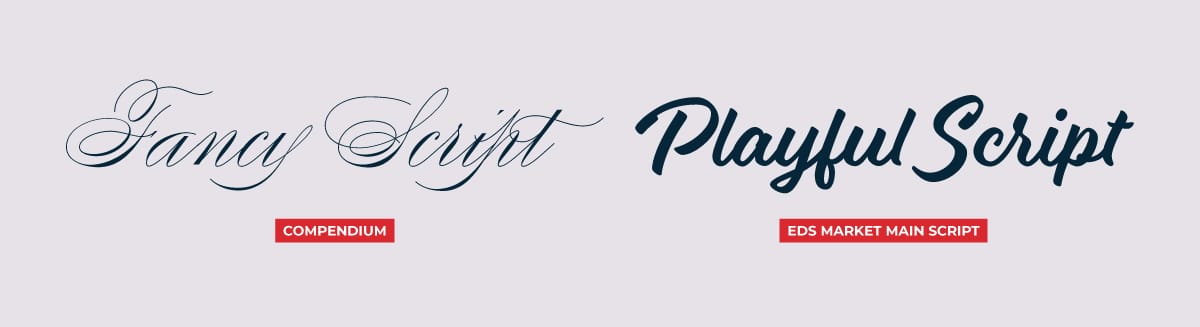
One of these fonts has very clean edges and many added swirls in the tails of the letters. This could be used in a scenario where someone wants their clients/customers/readers to feel special and “fancy” when they see it. The other font has a more handwritten and softer look. This might be used to show playfulness or happiness.
Now, I want to use this…
One of the best ways to put this into practice in your own graphics is to talk with a graphic designer. Not every font fits exactly into these categories, graphic designers are trained to look and decide on which fonts go where.
You may be missing out on the perfect fit when trying this out for yourself. However, a great way to learn about and experience fonts on your own is to pay attention to which fonts you see in everyday life. What font did you see at Canadian Tire as you walked through the isles? Were you fairly confident you would find what you were looking for? Consider the emotions that fonts start to bring up. These emotional responses can be a helpful way to learn more about fonts.
So, try it for yourself: take a step back and notice where you’re seeing certain fonts and what emotion they’re bringing up. And then – if you’re feeling brave – try playing with some yourself.