Starting a design project can seem like an overwhelming task at the beginning. There are many factors to consider and a lot of jargon flying around during the meeting. I often find myself defaulting into what I call “designer speak.” Graphic design has many technical terms. It’s essentially its own language and gets confusing very quickly. Terms such as vector, Pantone, and bleed can seem like total nonsense to those outside of our designer bubble.
Worry not, I have come to the rescue! Below you will find a compiled list of terms to help you get a better understanding of the technical language your graphic designer speaks.
General
Adobe
You’ll often hear designers reference Adobe. You may at least be familiar with Adobe Acrobat or you may have heard of the programs, Photoshop or Illustrator; these are programs included in Adobe Creative Cloud.
The Adobe Creative Cloud suite of programs has been the go-to for designers for decades. The suite is composed of various programs that serve various design purposes. The suite includes programs for photo editing (Photoshop), video editing (Premiere & After Effects), printing design (InDesign). Each program is set up differently depending on its main purpose.
Visual Identity
Your brand’s visual identity is made up of everything that relates to your brand. A visual identity consists of elements like a logo, colour palette, typefaces, and stationery. A visual identity is used to keep a brand looking consistent no matter where it’s used. The rules set out by your visual identity guide helps others who work with your brand to create graphics that are consistent with the brand created by your designer. Consistency with your branding helps your business be more recognizable to consumers. Eventually, they’re able to recognize marketing for your business without even seeing your logo.
Mock-up
Mock-ups are a designer essential, especially when designing product packaging with dielines. A mock-up is a realistic representation of a design. Mockups are used to give the client, and sometimes the designer a better visual sense of what a final design will look like.
Normally we use mockups for printed stationery and to give our clients a sense of what their new logo is going to look like in the real world.
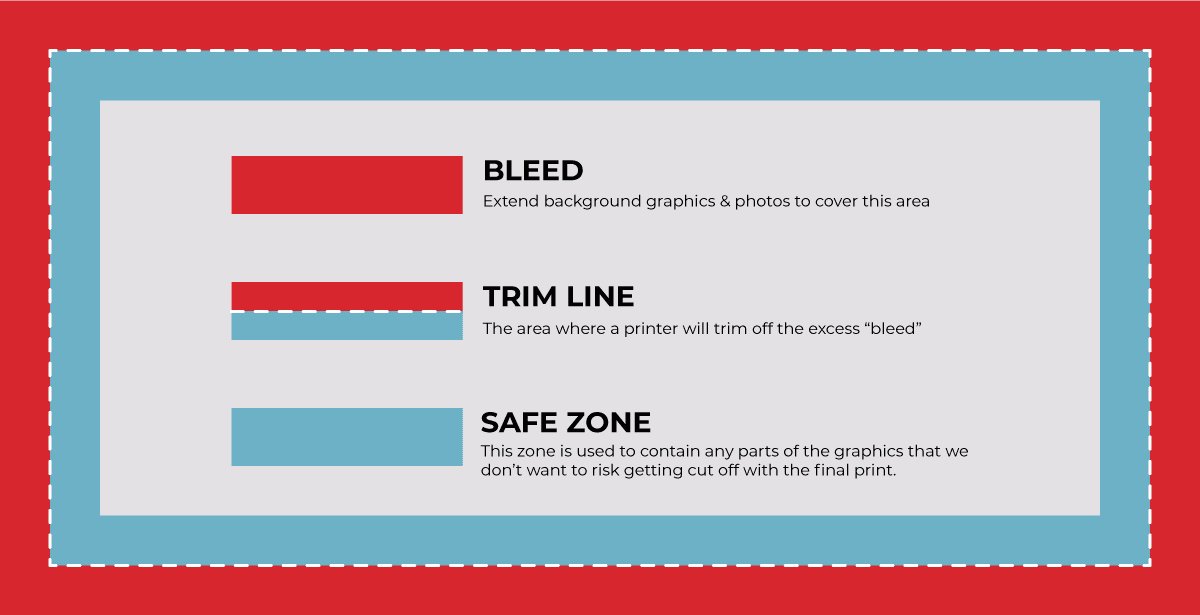
Bleed
The first time I heard this term in college, it threw me off. I asked myself “what does blood have to do with graphic design?” Thankfully, nothing. It’s a printing term that refers to the edge of the sheet that is going to be trimmed off. The reason designers use bleeds is to allow for margins of error when a cut is being made to the print. This way the printer doesn’t risk cutting off parts of the design.
Dieline
So first there were bleeds and now people are dying? What kind of work are printers doing?!
A dieline is actually a template that is needed to ensure the correct layout of a final physical package. If you were to take apart the cardboard box your pizza comes in, you will eventually be able to lay it fully flat. A dieline is the outline of that flat pizza box. When designers are creating packaging, we create the whole design on this flat template and use that to envision the final product.
P.S. Have you seen the pizza boxes we created for Ramona’s?
Colours
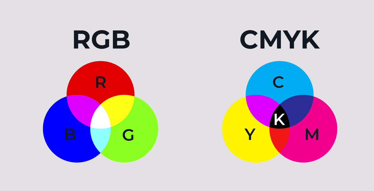
CMYK vs. RGB
CMYK stands for Cyan, Magenta, Yellow, & Black (Key). These are the colours used in printers. The 4 colours combine in various ways to produce the final product coming out of the printer. Designers use CMYK colours whenever they are creating a design that will be printed out.
RGB stands for, you guessed it, Red, Green, & Blue. This colour mode is used primarily for digital purposes. Your computer, your phone, and your TV are all using RGB to produce the images you’re seeing.
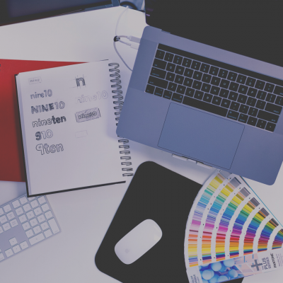
Palette
This term definitely isn’t exclusive to designers but it does mean something specific in the design sense. Palettes aren’t just a selection of random colours to work with. A palette is a set of colours that work together harmoniously and was chosen for a specific purpose by a designer.
Colours have psychological effects on consumers. Different colours will elicit different emotional responses. Designers select colours that work together to communicate a specific message based on several marketing factors such as demographics and brand messaging.
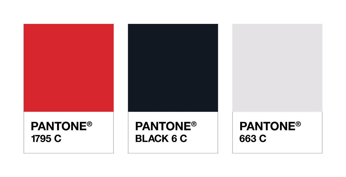
Pantone (PMS)
Okay, so here is yet another colour system designers work with. This one has very specific uses. The Pantone Matching System is a colour system used for blending colours when printing. I know, now you’re wondering, isn’t CMYK what designers use for printing colour? The answer is we use both.
Pantone has created an extensive library of colours which includes colours that don’t always have an exact CMYK match. Pantone inks allow for a more exact colour match in a printed product. Each colour is categorized using a specific number code that is referenced globally.
When creating a brand or a logo, designers will start by selecting Pantone colours, then convert them into the other colour values. We always provide clients with the information they need to use their colours within any colour system.
Type
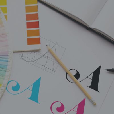
Typography
You might think you can put text anywhere in a design and it’s totally fine, but that’s not accurate. There’s a skill that goes into balancing text in a design and that skill is called typography. Typography is the art of arranging type to make it readable, legible, attractive, and engaging within a design.
The layout of text has a lot of impact on the way a design is viewed. Bad typography tends to be a big turn off for consumers. Even before I became a professional designer, I was always influenced by typography within advertisements. Taking written copy and presenting it in a visually appealing way is a vital part of design.
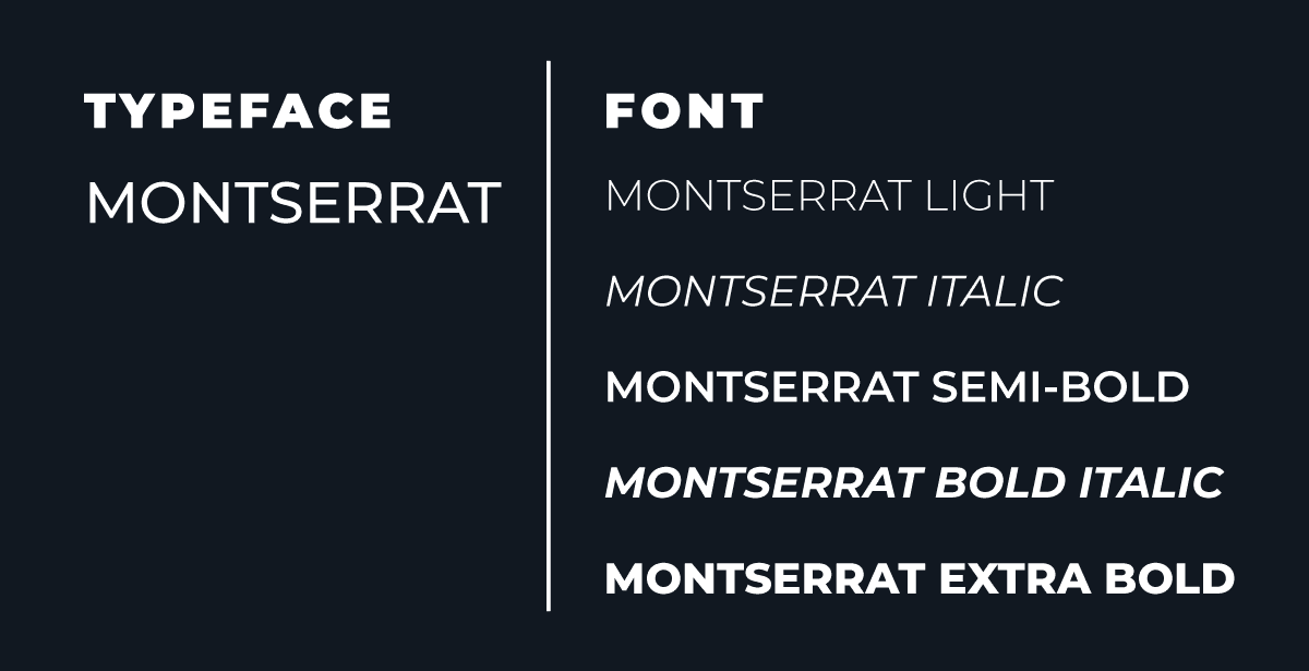
Font vs. Typeface
You would think these two terms mean the same thing, but they actually don’t. Since apparently I like using analogies to describe these terms, I’ll use another here. The typeface is like a mother and the fonts are her children.
Let’s use an example we all know of, Times New Roman. Times New Roman is a typeface, it collectively encompasses all the related fonts. Times New Roman, Bold, Italic, 12pt is a font. The term font refers to the different weights (bold, thin), sizes, and styles (serif, sans-serif) that a font comes in. Like a lot of other design terms, these two terms come from the old days of analog printing.
Back when all designs were created using a collection of metal stamps, these terms were used to categorize the various stamps they had to use.
Serif Fonts
I referenced this term in the Font vs. Typeface definition. A serif is a small line that appears at the end of a letter. A serif font is a style of font that has characters with serifs on the end of them. Serif fonts are a classic style. Times New Roman is one of the most well-known examples of a serif font. This text is written in a serif font.
Sans-Serif Font
This one is pretty easy since we live in a bilingual nation. Sans means without in French, so a sans-serif font is simply a font without serifs. A sans-serif font has a more modern look than a serif font. In this day and age, you’ll likely see more sans-serif fonts out there. Sans-serifs are more versatile than serif fonts, a serif automatically looks classic but a san-serif can vary depending on various characteristics of the font. The heading above is a sans-serif font.
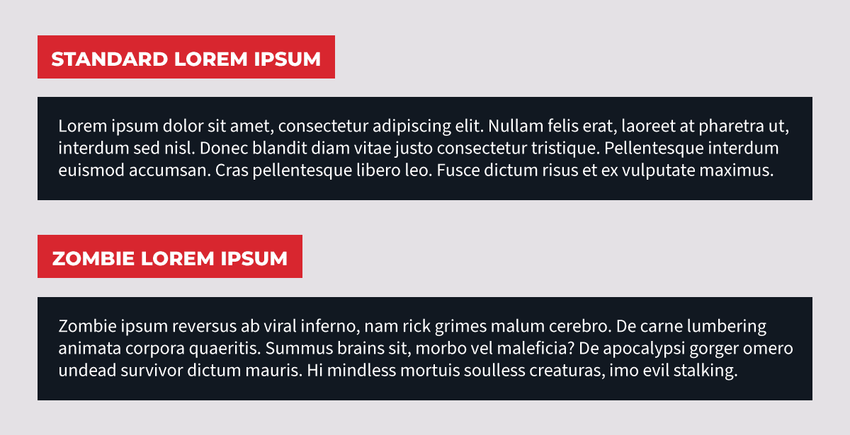
Lorem Ipsum
Lorem Ipsum or placeholder text is used to show the layout of a design without having to use actual written content. This text dates back to the 1500s when an unknown printer scrambled parts of an old Latin text to use as a placeholder while creating the layout for a book. The text was created with the intention of not distracting the viewer from the layout & design. The collection of random Latin text doesn’t capture focus the same way real written copy would.
People have even gone so far as to create “funny” versions of lorem ipsum. They ditch the Latin and replace it with random sentences about various subjects such as cats, cupcakes, and zombies! There is even a generator online that will create placeholder text based on a certain set of TV shows and movies.
File Types
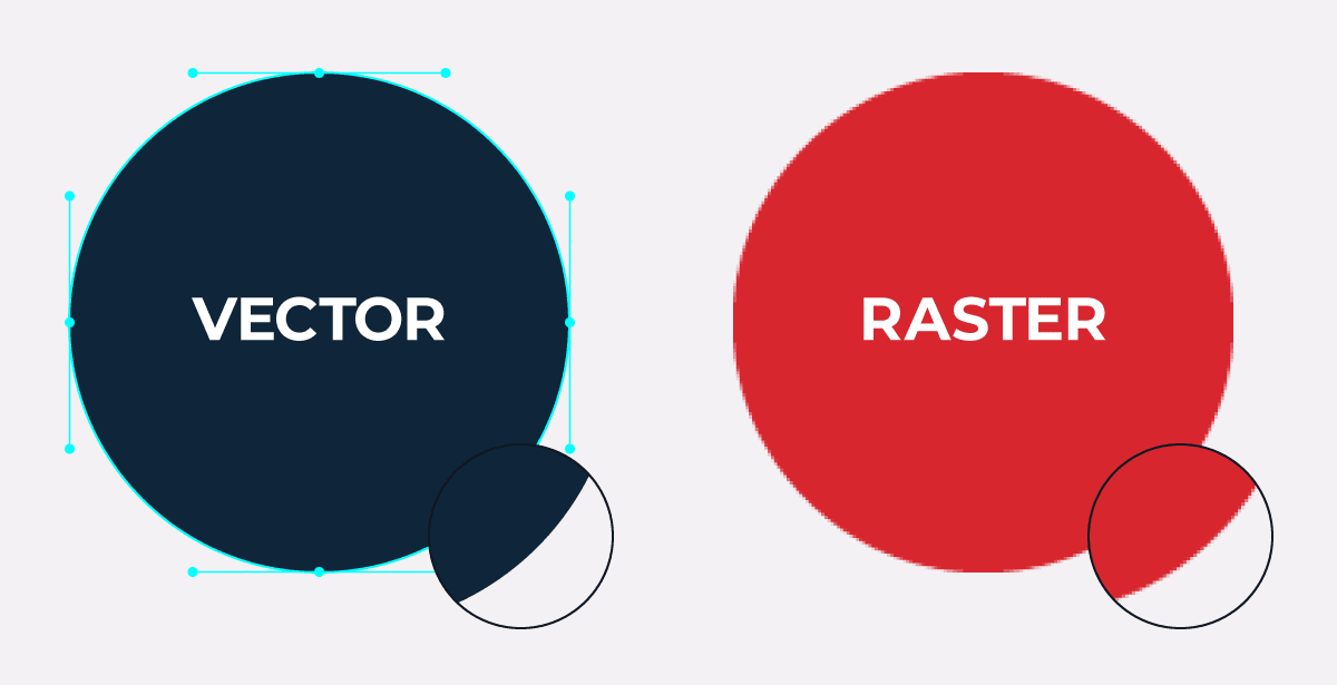
Vector
This is like the holy grail of design terms. It’s one of the most vital tools we have in our toolboxes. This term is very important to us, but it’s not something that is often understood by non-designers. A vector is a graphic image made up of math. Unlike raster images, which are made up of a series of coloured boxes, a vector image is created using a set of points that connect together to form a shape. The mathematical equations that make up a vector image allow the image to be resized without losing quality. You can make this as big as you want.
Logos are primarily created as vectors and you’ll often find designers requesting the vector file of your logo. They are almost always required when printing your logo. Designers can make raster images work in a lot of cases, but they are very restrictive.
Raster
Raster is a type of graphic image. You know when you zoom in really close on an image and it just becomes a bunch of coloured squares? That’s basically what a raster image is, a collection of coloured pixels that compile together to create a complete picture.
Rasters are widely used, but in some cases, they won’t work. A raster image can never be made larger than its original size without losing quality. The larger you go beyond the original size, the more pixelated/grainy the image will become. This same problem doesn’t occur when you make the image smaller.
Resolution
To put this one simply, it refers to the quality of an image. Generally, higher resolution images are better quality than low-resolution images. Images with low resolution appear blurry and pixelated.
The resolution of an image is very important when it comes to the printed design. Low-resolution images print out terribly and it is noticeable. High-resolution images are vital when it comes to any design project. A photo can make or break a design, and a blurry image will most definitely break the design.
Source File
This one is pretty straightforward. It’s the original file created of your design. Source files are important because they typically are editable files. You can easily change fonts and colours, which might not be easy to do with other versions of a design.
There are steps designers take to create final files for clients and usually this process makes the design more difficult to edit. That way, if a client or another designer opens the file, the file stays the exact same.
Now that was a long list of random words. Hopefully, this will help give you a basic understanding of a few designer terms so you don’t feel like your designer is speaking a language you’re not fluent in.