I think that everyone can agree that symbolism in a logo, mascot, or anything that represents your company is a good thing. A logo means that much more when it represents something, rather than being a collection of letters and swooshes (I’m looking at you late 90s tech start-ups). But what happens when you take something having meaning too far?
This topic has been brought to mind by the slightly terrifying mascots for the 2012 London Olympics. Seriously, look at those guys, they aren’t exactly cute and cuddly, they look angry. Am I the only one that is kind of bothered by the fact that they are “one eyed monsters”?
Their origin story is this:
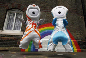
Wenlock and Mandeville are animations depicting two drops of steel from a steelworks in Bolton. They are named after the Shropshire town of Much Wenlock, which held a forerunner of the current Olympic Games, and Stoke Mandeville Hospital, a facility in Buckinghamshire that initially organised the Stoke Mandeville Games, the precursor of the Paralympic Games. [source]
Great, someone’s thought out the names of these little guys. What else is a symbol here? Well, Wenlock’s little horns are supposed to represent the levels of the podium, his body pattern is supposed to represent the world coming to London, his bracelets are in the colours of the Olympic rings, the little light on the top of their heads is supposed to represent London’s famous black cabs, and the shape of his head is supposed to be reflective of the Olympic Stadium.
And all together these elements combine to form one terrifying mascot. It’s too much. Mascots are supposed to appeal to kids and be used to sell more merchandise. I know I can’t speak for everyone, but I don’t want a hoodie with Wenlock’s security-camera eye looking at me from it. These guys aren’t inviting, friendly, or anything that I would want the world to think of my city.
The thing is, I’m sure that the fine folks at Iris, who designed Wenlock and Mandeville, had the best intentions in mind when they did so. They thought long and hard about what they wanted the mascots to be, and did a great job in some ways, like in the planning for just how they would be used, like giving the mascots their own twitter feeds. Unfortunately though, as anyone who’s ever painted knows, that the more colours you add together, the more likely you are to end up with a mess of something you can’t use. I think that’s what has happened here.
Like many things in life, keeping it simple is often the way to go. In my opinion something that more accurately represents how London appears (or would like to) appear to the world would have been a better choice, with such a long history and rich culture there had to be something more to choose from. Heck, even a smiling, anthropomorphic corgi would have been more appealing.
Symbolism is great, but there always needs to be a balance between that and what your audience needs to see.